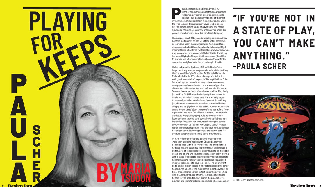
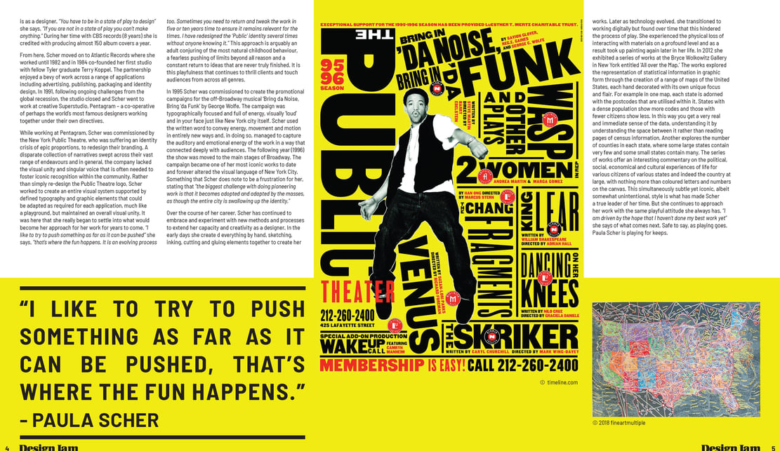
I selected a san serif-font family, with a range of different weights and styles, which I used in a way that reflects Paula Scher’s style. I am inspired by how she pushes and breaks the grid in a way that generates interest in her designs. I aimed to use similar techniques in the title page whilst maintaining a clear hierarchy. My use of lines aims to resemble the boxes Scher uses in her ‘Bring in 'da Noise’ poster to help maintain that grid. The yellow selected extends the poster's style across the whole article. I really love how effectively the article tells a story through the placement of imagery and quotes relevant to the context of the article.


